Promote resort properties and increase call volume for Vidanta Resorts
Client
Vidanta Resorts
Role
UX Designer
Timeline
Dec 2018
Summary
American Express offers cruise bookings to its cardholders through a travel program utilizing Arrivia's white-labeled platform. To address the platform's dated design and subsequent low conversion rates, I executed a comprehensive redesign. This initiative focused on implementing contemporary design principles and optimizing the user journey, with the goal of increasing booking volume.

The problem
Vidanta Resorts was having difficulty with an increase in resort bookings despite marketing efforts. They were not filling their resort occupancies to the levels desired. Vidanta asked us to come up with a campaign to push bookings to our members.
Project goals
Educate members on Vidanta properties
Increase bookings for Vidanta resorts
Drive calls to call center to up-sell
Intuitive mobile-first landing page and microsite
Methods
User research
User journey
Wireframing
Prototyping
Research & design
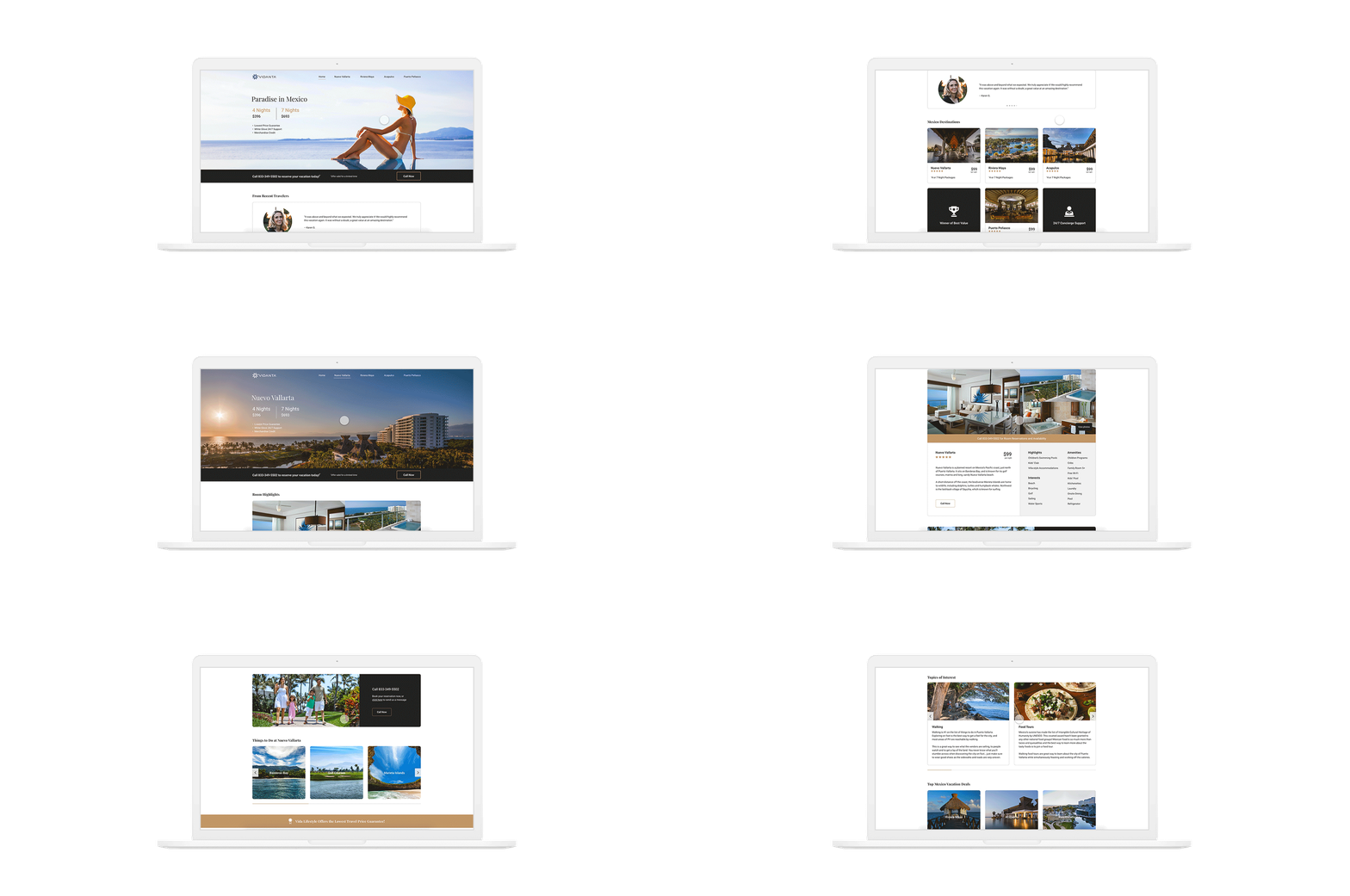
After researching more about Vidanta properties in different parts of Mexico, I gained a better understanding about what they offered. With the content provided from marketing to provide a more accurate landing page, I was able to use that information to help educate new users on the Mexican resorts.
The journey started with the user receiving marketing emails that led the user click through to the microsite landing page. With the intuitive and mobile-first design, the user could easily go through each Vidanta property and educate themselves better to see what property they would be interested in purchasing a multi-night stay with. They would then call using our main action button and book a stay with Vidanta through our call center.
When designing the microsite, we wanted the designs to be mobile-first so that they could easily be responsive to desktop, while also allowing our main users on mobile to have an intuitive experience. By using blocks such as peaking carousels and containers for the content, it could easily be molded into a desktop format.
With this format, the user is easily able to digest the information and become more educated on each resort property quickly so that they could have an easier time deciding which resort property they would enjoy staying at.
Mobile-first
One of our main goals besides educating the users about Vidanta resort properties was to drive calls to our call center to sell these multi-night stays to our customers.
In order to effectively push the calls, we decided to affix the call to action button to the bottom, leaving it stickied as the user scrolls through the page. By leaving the action fixed, we give our users the option to begin calling at any point during the experience. Once they have looked through the content and the different properties, they could click the action button to begin their call.
This method was very successful in driving calls to our call center as we had over 5,000 calls in one week of it being released.
Drive calls

Takeaway
Even though the microsite was successful at driving calls to purchase nights at Vidanta resorts, our call center was not staffed quickly enough nor educated on the offer and lost the sale.
From this project, I learned that even though you can bring users through a portion of the journey, it does not always mean their journey is complete.
Overall, I am still happy with how this turned out as I was able to deliver calls effectively with this microsite and the help of marketing to push them to the landing page via email campaigns.


