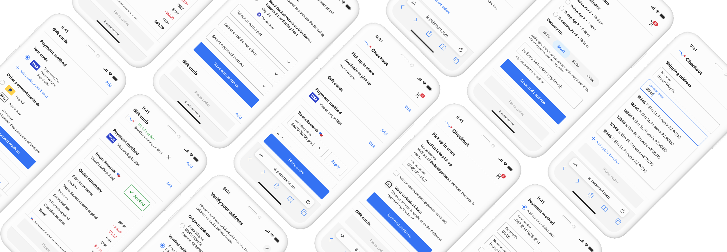
Improving conversion with a streamlined checkout experience at PetSmart
Client
PetSmart
Role
Principal UX Designer
Timeline
Aug - Nov 2024
Platform
Web, App
Summary
PetSmart's web checkout featured a dated stepper design, and the app utilized an iFrame version of the web experience, contributing to increased abandonment rates. As the sole designer, I led a comprehensive redesign focused on streamlining the experience for users to expedite the time it took for existing users to checkout.
To accomplish this, I took this project through all stages of the UX process and championed conversations with stakeholders and technology to find viable solutions to reach the market sooner. Through rigorous user testing and iterations, the initial solution was implemented with future feature enhancements in product’s roadmap to further improve the experience.
Impact
Both the initial phased rollout, and iterations produced great results:
13%
Increased total conversion
11%
Increased sign ups
9.6%
Increased revenue per visitor
3 minutes, 44 seconds
Reduced time on task
$89 million
Increase in annualized revenue
77+
Net Promoter Score (NPS)
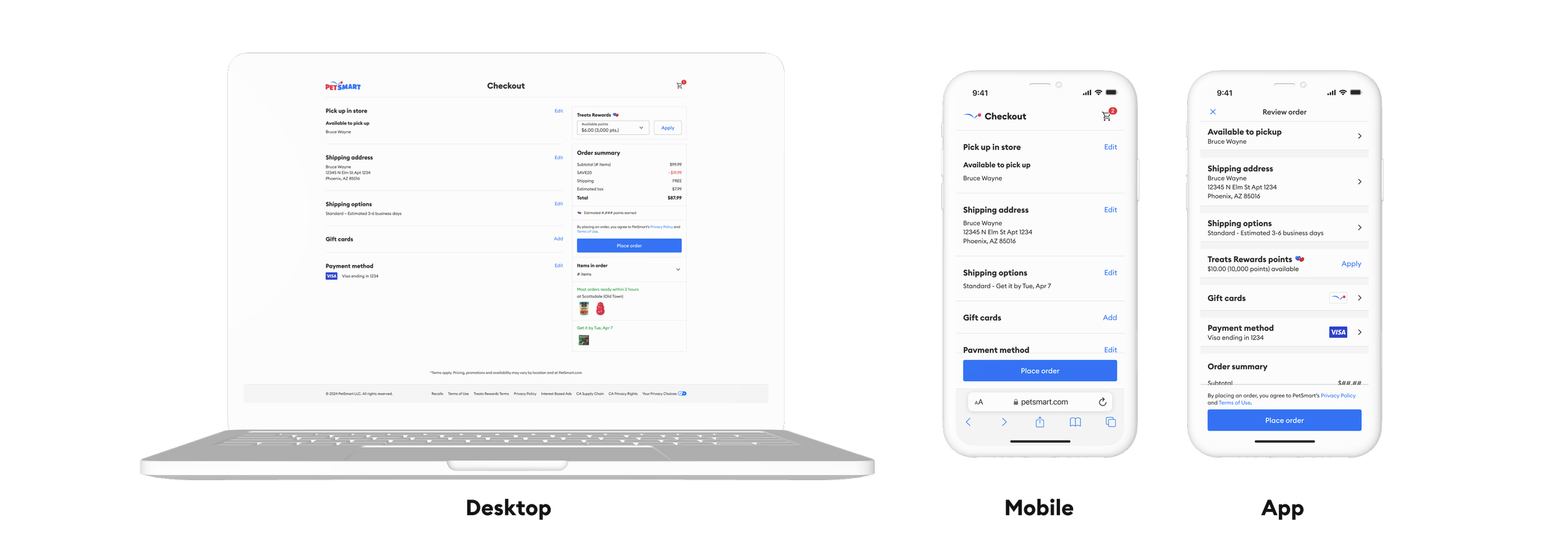
New web and app designs for mixed checkout
Problem statement
PetSmart’s checkout experience was underperforming market average, leading to increased cart abandonment rates. Users attempting to complete purchases within PetSmart’s web and mobile application were experiencing a frustrating and time-consuming checkout process due to an outdated interface lacking intuitive navigation and clear information. The interface did not adhere to Human Interface Guidelines or Material best practices, resulting in a clunky and unfamiliar user experience that hindered usability and eroded trust with pet parents.

Legacy web & app designs
Goals
Increase conversion rate
Reduce the amount of time spent in checkout
Reduce cart abandonment rate
Increase customer satisfaction and loyalty through brand perception of the digital experience.
Discovery & research
“Very cumbersome, kept failing yesterday, too many buttons and other stuff to tap. The credit card expiry date doesn’t autofill from Google payments. Make it easier to spend my money with you!!”
Analysis of post-purchase customer feedback, derived from Medallia surveys and Contentsquare session recordings, revealed significant pain points within the checkout process for our pet parent users. Key areas of user friction included:
Inefficient flow for signed-in users: Existing signed-in users expressed frustration with the linear, step-by-step nature of the checkout process, indicating a desire for a more streamlined and personalized experience.
Excessive form fields: The number of required form fields during checkout contributed to user fatigue and potential abandonment.
Ambiguous error states: Non-descriptive error messages hindered a users' ability to effectively address and resolve issues, resulting in frustration and delays.
Difficulty applying loyalty points: Users encountered challenges in locating and utilizing loyalty points during the checkout process, suggesting a lack of intuitive integration and visibility.
These findings highlighted critical opportunities to enhance the user experience by optimizing the checkout flow, reducing cognitive load, improving error communication, and ensuring seamless integration of loyalty program benefits.
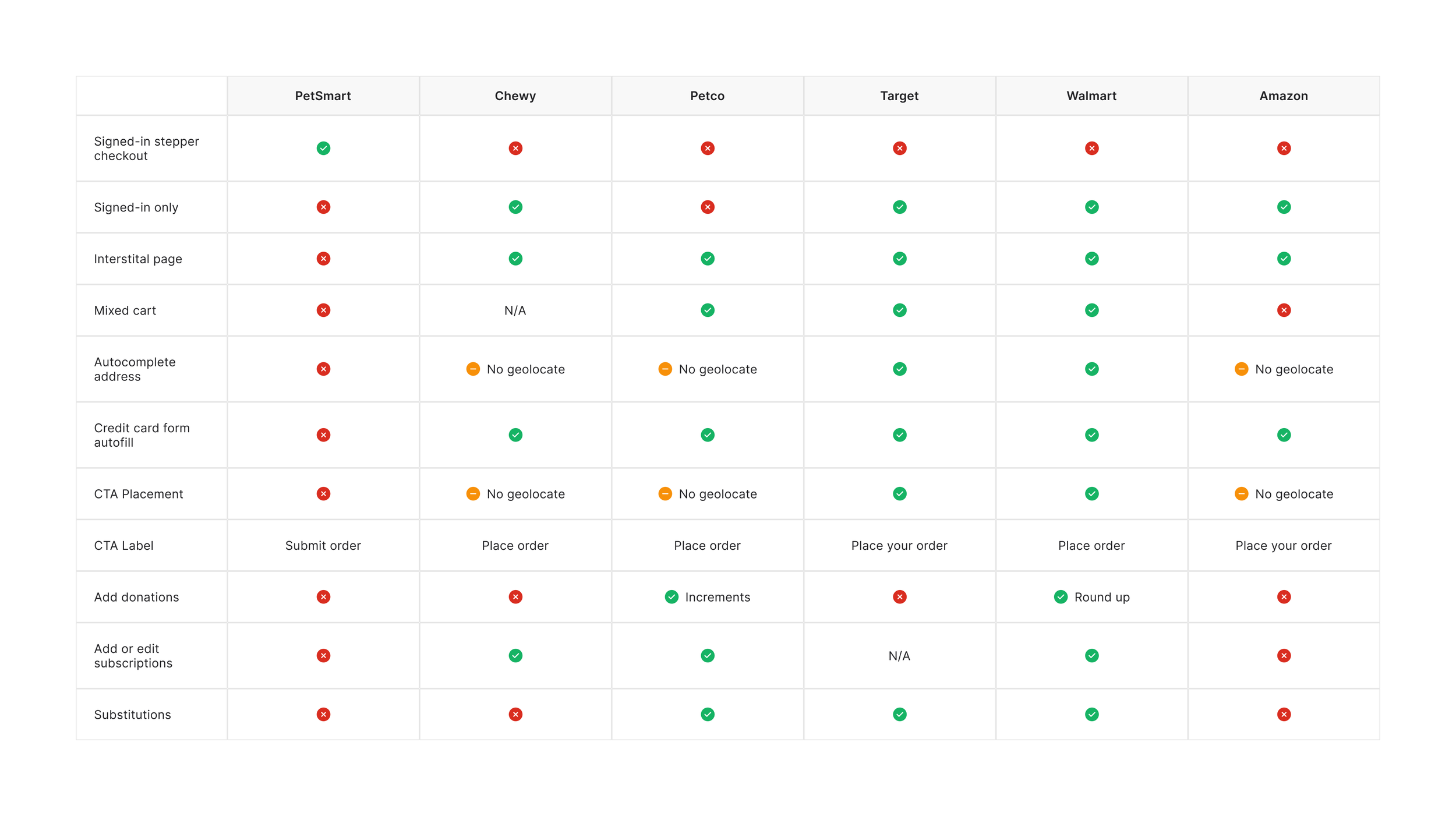
Competitive analysis of retail competitors checkout experiences
Competitive analysis
From the competitive analysis, it was clear PetSmart was underperforming in several areas of a modern checkout experience. Some of the main opportunities stemming from the analysis included:
An intuitive and streamlined flow to expedite user’s to place an order
Interstitial page for guest checkout and sign in
CTA placement prominence
API integrations with Google Payment
Geotargeting for autocomplete addresses & verified addresses
Requirements & recommendations
After identifying checkout issues, I collaborated with product and tech teams to prioritize improvements using the RICE model. We tackled immediate user frustrations with quick fixes while simultaneously redesigning the entire checkout experience for a better brand perception.
A key focus was simplifying the checkout for loyalty members, enabling a single-tap purchase to address the frustration with the existing multi-step process. This targeted approach aimed to maximize impact by focusing on the largest user segment.
Ideation & prototyping
Building upon insights from the discovery phase, I developed initial design concepts through the wireframing process to establish a streamlined checkout framework.
Prioritizing user efficiency and Medallia feedback, the design for both web and app shifted from a multi-step process to a consolidated review screen, enabling returning signed-in users to complete purchases with a single tap.
To ensure a consistent and intuitive experience, native app components were leveraged, minimizing technical debt. Furthermore, the primary call-to-action was strategically positioned at the bottom of the screen for optimal thumb accessibility.
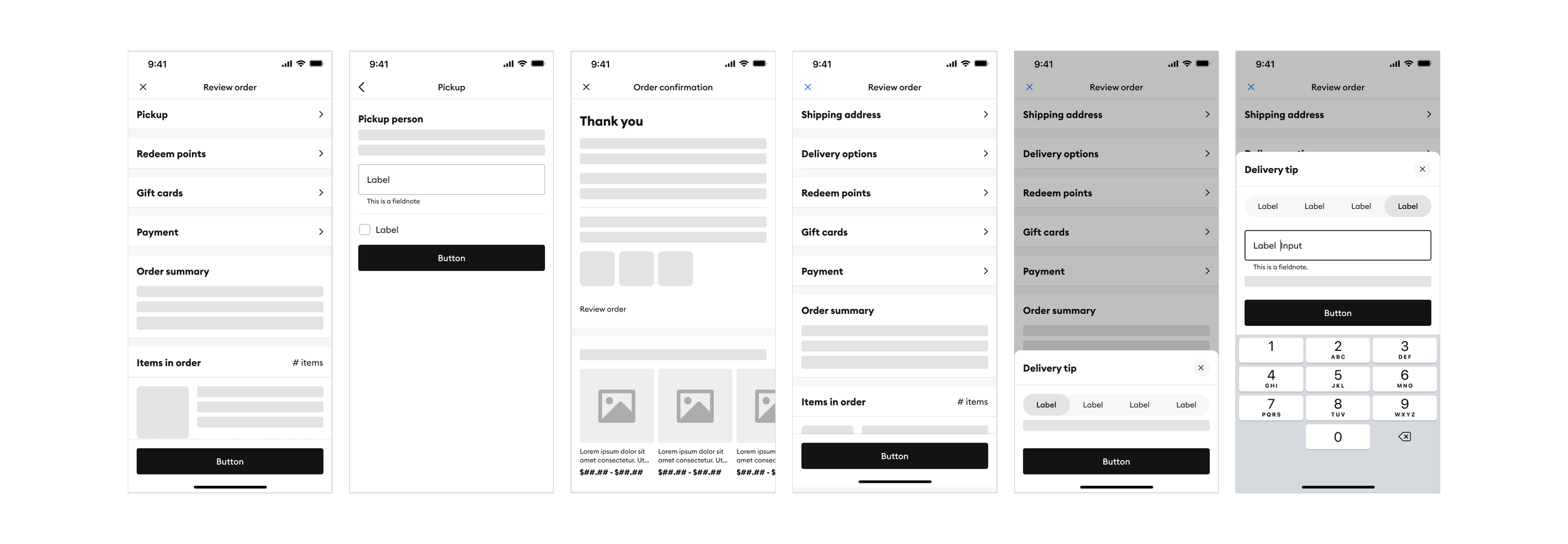
App wireframes
Testing & iterations
Following the development of skeleton wireframes for layout, I created initial UI designs leveraging our design system, for user testing. The primary objectives of these tests were to validate:
Usability of the consolidated review screen
Assess users' ability to intuitively navigate, edit, & place an order
Reduce cognitive load within sections
Findability of topics within sections
Consolidating the stepper process
The interface was implemented with required content to meet product requirements. Steps such as the ‘About you’ and ‘Pick up in store’ were consolidated to reduce the amount of redundancy users encountered with duplicative fields. Additionally I added the dynamic disabling of the "Place order" button during edits to prevent errors.
Usability testing showed a 100% completion rate for guest users and a 90% success rate for signed-in users, with both groups finding the process easy. The app version, using native list components for a streamlined view, was also well-received, with users finding it intuitive and familiar to other retailers used.
Web guest view of Pickup method
App signed-in view of Delivery
Call to action placement
A comparative usability test was designed within UserTesting, employing an A/B testing approach, to determine the optimal call-to-action placement on desktop checkout. Option A presented users with dual call-to-actions, while Option B featured a single call-to-action positioned under the order summary.
The study, involving 15 participants, revealed that both design options were perceived as highly usable. However, 12 participants indicated a preference for Option B, citing its familiarity and alignment with their expectations based on established online checkout patterns, a finding consistent with Jakob's Law.
Call to action - Option A
Call to action - Option B
“Option A button is the first thing you see, so it’s clearly easy. But every site that I shop at usually has the place order button under the order summary like Option B. So, my choice is Option B because thats where I’d expect to find the button.”
Reduce cognitive load in Veterinary section
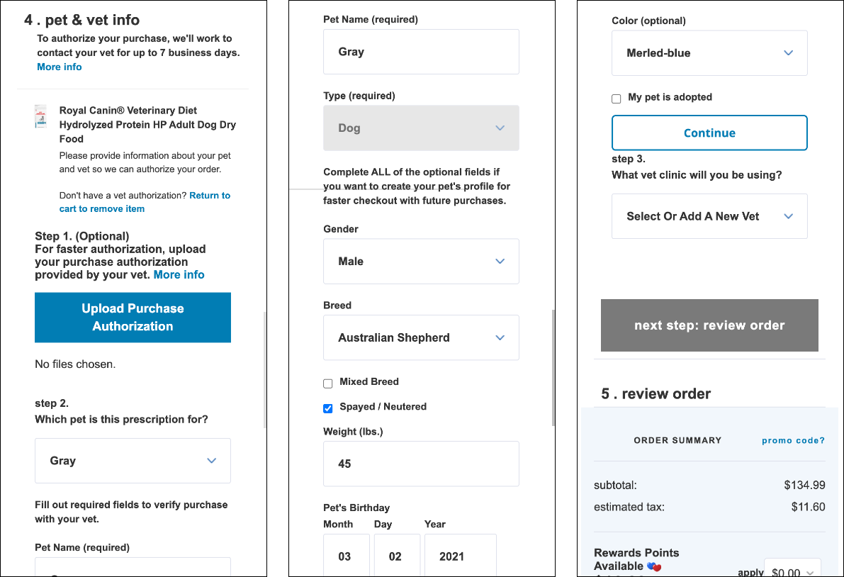
The legacy veterinary section had a cumbersome form, requiring even signed-in users to re-enter pet data. The crucial authorization upload option was often missed, slowing approvals. Additionally, the continue button was confusing, leading to abandonment.
To fix this, field requirements were streamlined, and the information architecture was redesigned to clearly offer users a choice between uploading authorization or having PetSmart contact the vet.
Usability testing confirmed the improvements, with a 100% completion rate and 90% of participants finding the process very easy.
Legacy screen of Veterinary info
New screen of Veterinary info
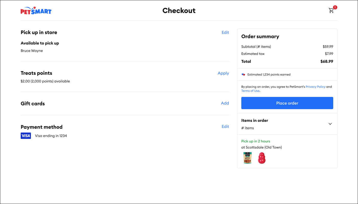
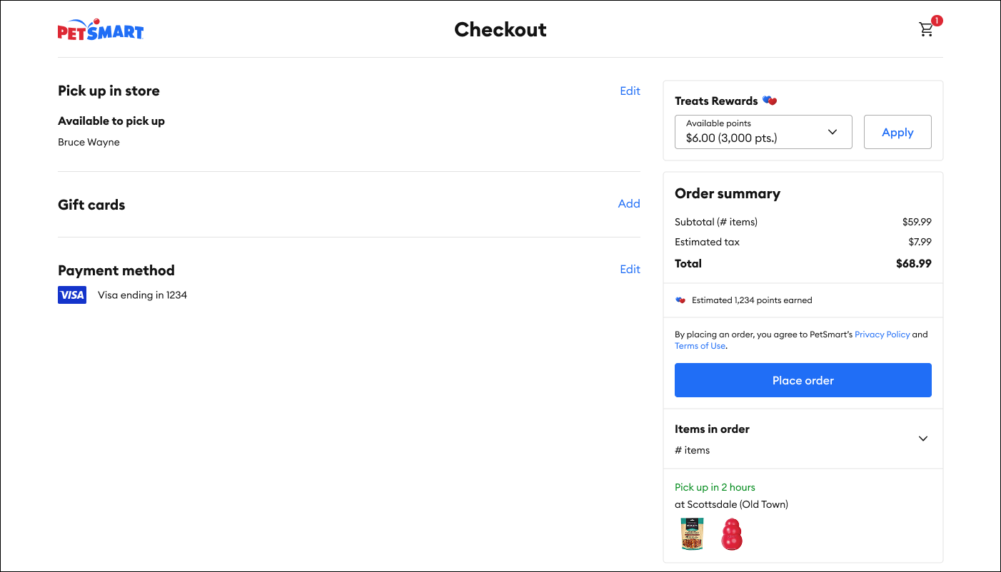
Adding visual prominence to applying points
On the legacy website, users struggled to apply loyalty points. The initial redesign placed the redemption option in the left-hand section, but user testing revealed placement issues and a desire for incremental point application. Based on this feedback, the design was revised, moving the 'apply points' section above the order summary and adding incremental functionality. Subsequent testing showed a significant improvement in user satisfaction.
In the app, loyalty point redemption was entirely absent. To address this, a prominent redemption feature was designed and placed above the fold. Usability testing confirmed 100% successful application.
Following positive user feedback, the incremental redemption feature, along with its financial implications, was presented to Product and Loyalty stakeholders for review and alignment before moving forward.
Apply points within editable sections
Apply points within Order summary
Handoff & results
After positive user testing, the refined designs were prioritized for launch. To ensure smooth development, detailed specs and annotations were provided. Active participation in refinement discussions with Product and Development teams further ensured alignment with project requirements during sprint planning. Using design system components sped up front-end development.
A phased rollout (1%, then 50%) replaced A/B testing to manage risks. Significant performance gains (10-19% lift, 95% confidence) were observed, leading to a full rollout and an estimated $89 million increase in annualized revenue.
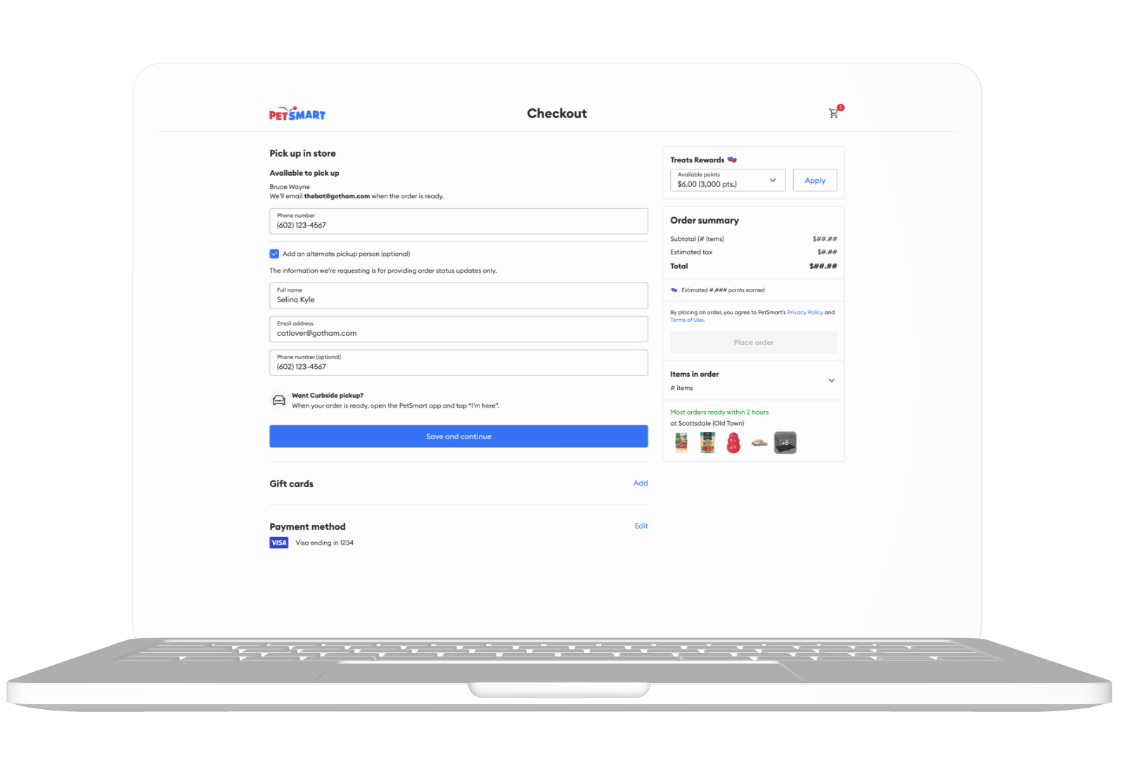
Addressing user feedback regarding pickup process friction, I redesigned key interactions. This included reducing cognitive load through field consolidation, enabling users to easily manage alternate pickup contacts, providing transparent and dynamic SLA information, and resolving ambiguity in multi-store selections.
Pickup checkout
Mobile Web Pickup screens
Desktop Web Pickup screens
App Pickup screens
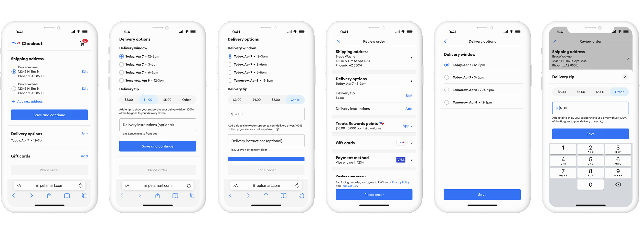
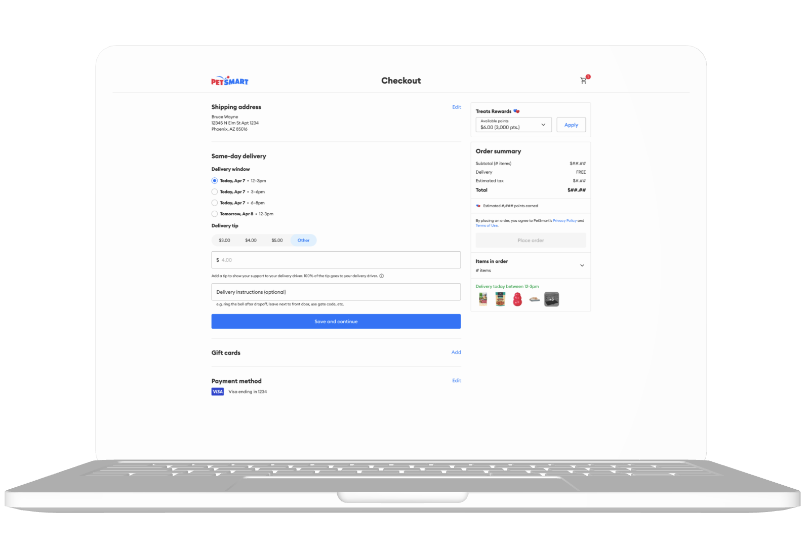
I improved the same-day delivery user experience by focusing on clarity and efficiency. This involved redesigning time slot selection to provide greater transparency, reducing process steps by implementing a default to the soonest delivery time, and designing intuitive tip interaction patterns.
Delivery checkout
Mobile Web Delivery screens
Desktop Web Delivery screens
App Delivery screens

Reflection
The comprehensive redesign of this critical e-commerce touchpoint represented a significant undertaking, yet it offered a unique opportunity to profoundly enhance the pet parent experience.
This project established a strong foundation for future development, enabling the implementation of additional features informed by user feedback and research which did not make the initial implementation. Moving forward, I will partner with Product, who uses the RICE model, to strategically prioritize these feature enhancements and to ensure optimal user satisfaction and alignment with user expectations.


