Reimagining a cruise booking platform for American Express cardholders
Client
American Express
Role
UX Designer
Timeline
Sep 2019 - Jan 2020
Summary
American Express offers cruise bookings to its cardholders through a travel program utilizing Arrivia's white-labeled platform. To address the platform's dated design and subsequent low conversion rates, I executed a comprehensive redesign. This initiative focused on implementing contemporary design principles and optimizing the user journey, with the goal of increasing booking volume.

Problem statement
American Express Travel's white-labeled cruise platform, powered by Arrivia, was underperforming. Low booking rates were attributed to a disjointed user experience, frequent errors, and a non-responsive mobile design that hindered navigation. The platform also lacked visual consistency with American Express's other travel products, creating a fragmented brand experience.
Goals
Increase cruise bookings on American Express Travel
Maintain cohesive branding throughout user journey
Improve mobile experience with user-requested functionality and an intuitive interface
Empower cardholders to book at American Express with Membership Rewards® points on cruises
Initial phase
The existing cruise platform, originally designed for desktop, struggled to provide a seamless mobile experience. Its responsive design approach resulted in interface inconsistencies and navigation challenges, hindering user engagement and contributing to low booking rates. Furthermore, the platform's outdated branding clashed with American Express's updated visual identity, creating a disjointed brand experience.
The initial phase of the redesign focused on small updates to the interface to our latest product in order to increase overall bookings, with plans to address the end-to-end experience more comprehensively in a later iteration.

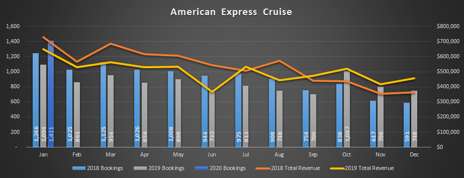
Initial phase bookings grew 30% in October 2019
Following the October 2019 launch of the initial UI enhancements to Arrivia's cruise storefront, American Express saw a 30% month-over-month increase in cruise bookings. Consistent revenue growth throughout 2019 further validated the positive impact of the interface changes.
These results confirmed the effectiveness of the initial UI improvements and reinforced the potential for even greater gains through further enhancements to the user experience.
Product redesign
After the initial adjustments showed consistent growth, American Express and Arrivia prioritized the redesign with a complete overhaul of the cruise experience from beginning to end.
Methods
User research
Competitor analysis
Consumer feedback surveys
User flow
Wireframes
Prototyping
User testing

Research & design
Competitive analysis revealed key user expectations for cruise booking platforms, including multi-cabin selection, support for multiple guests, favoriting, and sharing functionality. These features were then prioritized as must-haves for the redesign.
Adopting a mobile-first design strategy, with future app scalability in mind, we incorporated intuitive navigation elements such as a dedicated back button. This ensured users could easily navigate within the booking flow without relying on the browser's back functionality, preventing potential frustration and loss of progress.
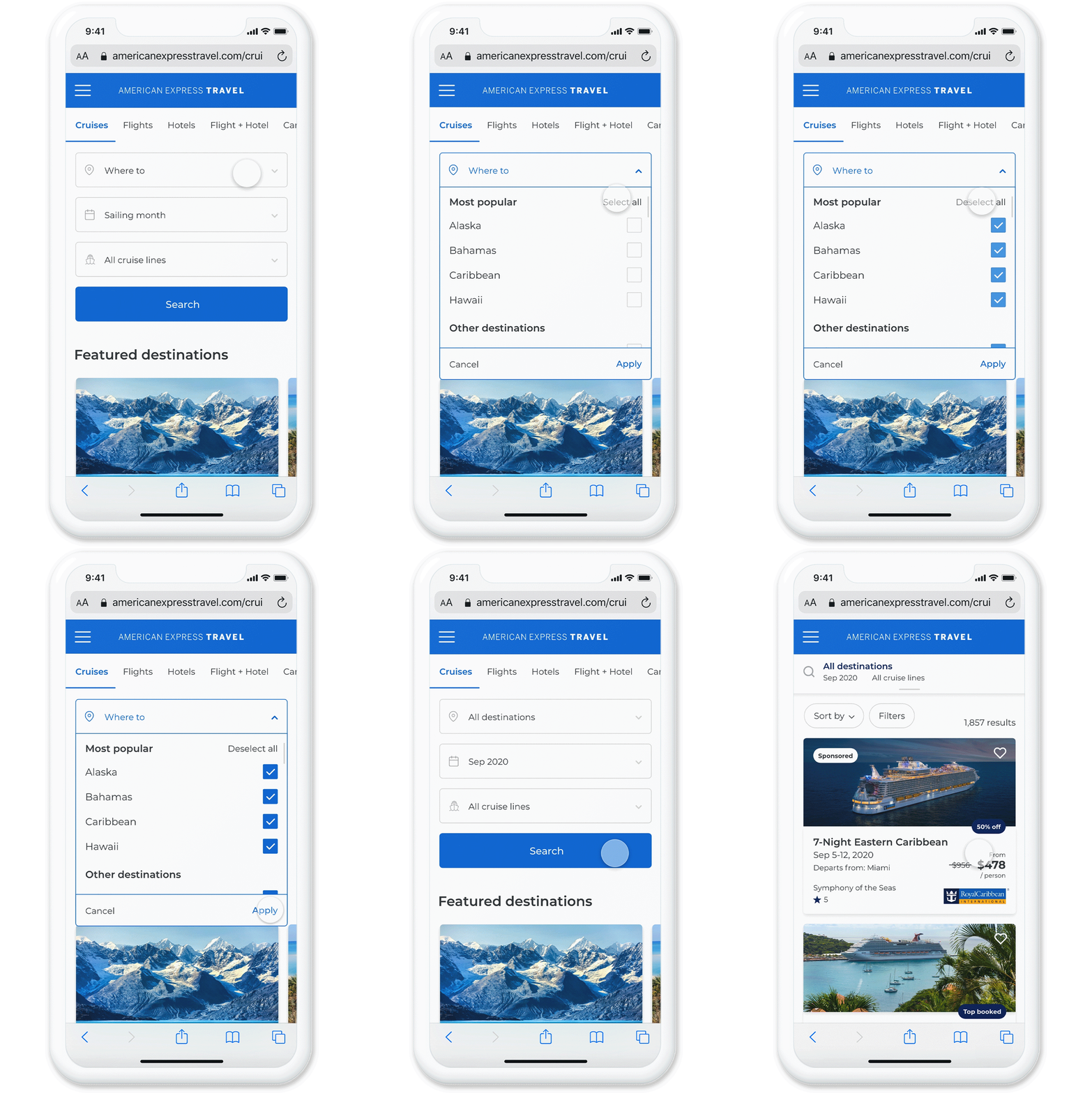
To address user frustrations with the search process, we implemented enhanced filtering options, allowing users to refine their search by multiple destinations, sailing months, and cruise lines. This significantly reduced the number of results, empowering users to find relevant cruises more efficiently.
I also redesigned the search widget to minimize it’s vertical space, creating room for strategic marketing placements.
Search Widget
Recognizing that mobile users needed greater control over their search results, I implemented sort and filter functionality. A 'Sort By' dropdown and comprehensive 'Filters' modal were added, empowering users to quickly find cruises matching their specific criteria.
The original cruise card design also presented challenges, with key information often falling below the fold. I redesigned the cards, reorganizing content, incorporating tags and a 'favorite' feature (supporting marketing initiatives), and optimized the layout to display more options above the fold.
The cruise overview page was streamlined to prioritize itinerary information. A tab system was implemented for easier content digestion, and a sticky 'Select Stateroom' button ensures a seamless transition to the next step in the booking process.
Search results and overview
Addressing a key user pain point, I implemented multi-cabin and multi-guest selection functionality. This feature was strategically placed within the 'Travel Party' page, accessible after users select a stateroom, signaling their commitment to booking. The 'Travel Party' page allows users to specify the number of guests (from seniors to children), add multiple staterooms, and apply relevant discounts (e.g., past traveler, military service).
Continuing the booking flow, users can then choose their preferred cabin type and specific cabin options within that category. They can also opt for automated room selection or manually choose their stateroom. Finally, responding to user requests for additional cruise options, I integrated the ability to add packages such as drink packages and Wi-Fi before checkout, allowing users to review a comprehensive summary of their selections.
Cabin select
The legacy checkout process, lacking mobile responsiveness, required a complete overhaul. Adhering to Jakob's Law, I implemented a streamlined, four-step checkout process (Guests, Options, Payment, Summary), leveraging users' familiarity with established booking site conventions. Leveraging existing American Express card member accounts enabled pre-populating the first guest's information, significantly accelerating the checkout process.
To enhance the value proposition for card members, I integrated Membership Rewards® point redemption directly into the payment step. Users can easily toggle between applying all available points, partial points, or no points to their booking.
Finally, the confirmation page was strategically designed to cross-sell related travel verticals (hotels, air) based on the user's cruise itinerary, encouraging continued engagement within the American Express Travel ecosystem
Checkout

Takeaway
This project provided a valuable learning experience, challenging me to lead the redesign of the entire cruise booking experience. A key aspect of this effort involved gaining a deep understanding of our existing platform and its unique constraints as a closed-member, white-labeled solution for American Express, particularly in comparison to competitor offerings.
I'm pleased with the results of this extensive project, which represented a significant portion of my recent workload. Recognizing that user feedback and testing are essential for continuous improvement, I look forward to the ongoing evolution of this platform and it’s positive impact on AMEX card member cruise bookings.
To view the full prototype experience, click here.


